
Rethink Coastal: A La Jolla Cottage Gets a Colorful Overhaul
When asked to help one ocean-loving client reimagine the color palette for their 700-square-foot home in La Jolla, I leaped at the chance. As an open-water swimmer, I’m also passionate about all things ocean-related, but I have a special place in my heart for small spaces (and the challenges they sometimes present).
Playing with light and shadow
One of the biggest hurdles for this space is that it’s flooded with light in the morning, then plunged into shade for the rest of the day. These extremes mean that colors change dramatically at different times.
The previous occupant had embraced grey walls and flooring alongside a decorator’s white for the ceiling and trim, which was doing the place no favors at all. By late afternoon, the shaded areas had taken on a bruisy blue-purple hue, which made the space feel oppressive and gloomy.
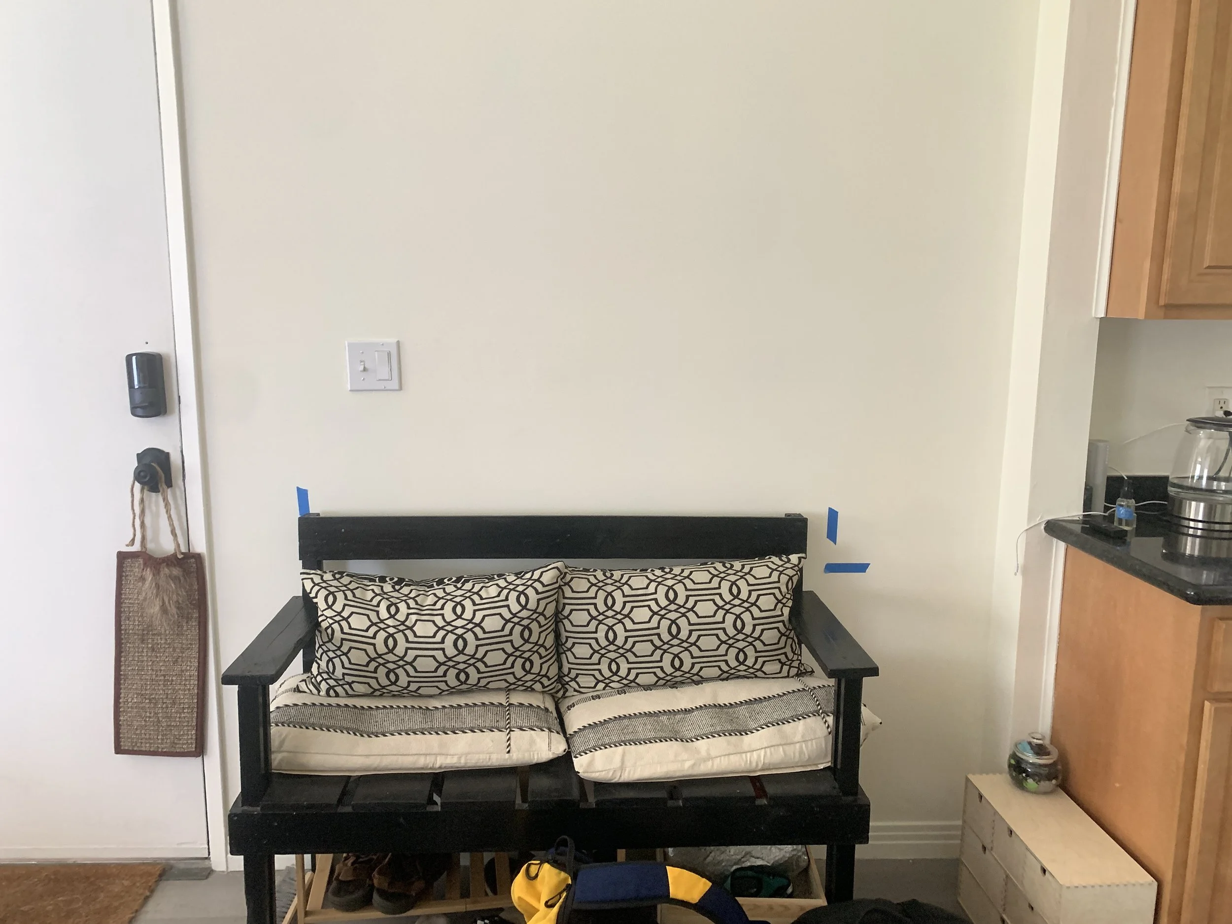
Before:
My client wanted to optimize the morning light with a palette that would be enlivening, not dazzling, and then cozy and enveloping in the evening. It needed to complement the existing artwork and furniture and help define the spaces in this small, open-plan home.
Ode to the ocean
After a debrief about how my client uses his space, when, and how he wants to feel in it, our conversation shifted to his lifestyle. More specifically, his happy place: the ocean. The cottage is set one mile from the beach, so a nod to its geographical setting made sense, but we were keen to avoid cliches. Strictly no store-bought seashells and blue and white stripes.
Armed with my trusty camera, I explored nearby La Jolla Shores at low tide, snapping plump purple sea stars and pale green anemones in tide pools. The shoreline was covered with pulpy brown-red kelp, glossy clumps of grass in slick olive piles, and sand the color of a damp chamois cloth. This wasn’t the caricature of saturated color we often associate with beachscapes, but a richer, inkier, more muted palette with shots of unexpected color from neon nudibranchs and lavender sea urchins.
Rock pool palette
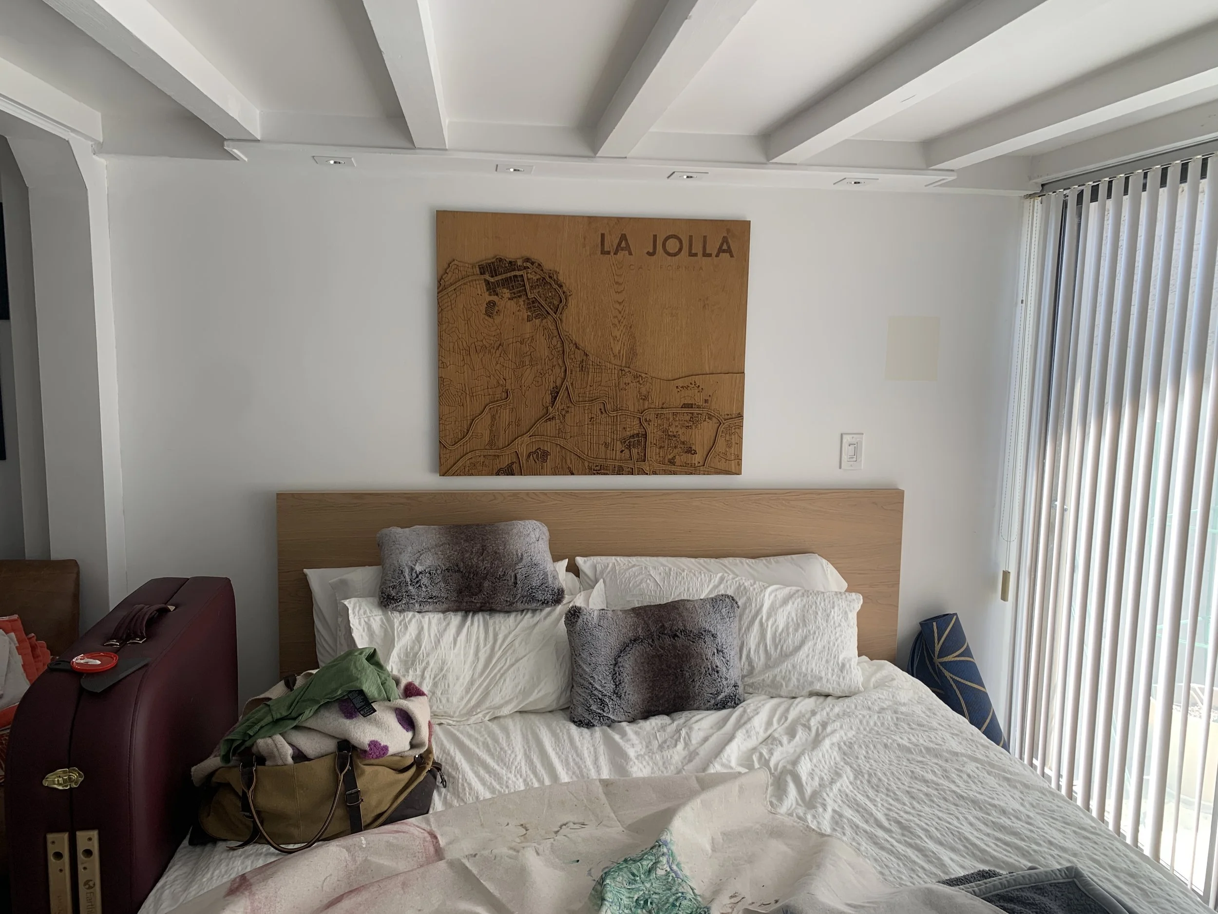
Inspired by this kaleidoscope of possibilities, I reflected on how a low tide palette might work alongside my client’s existing furniture, natural and artificial lighting, and the architectural elements that give this home character, like wooden beams in the bedroom. (We planned to purchase additional items to complement this palette and my client’s furniture.)
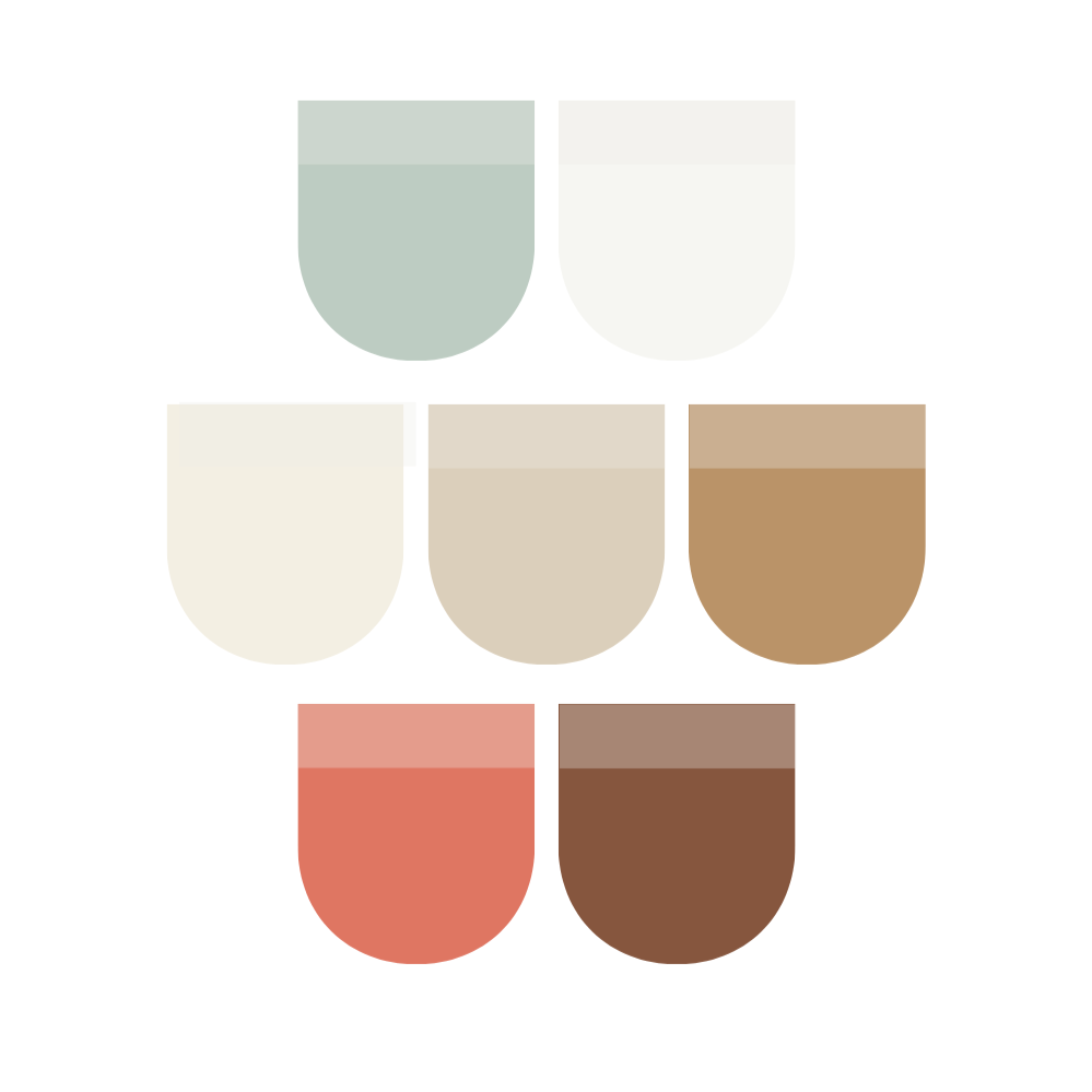
The final edit:

Anything but boring
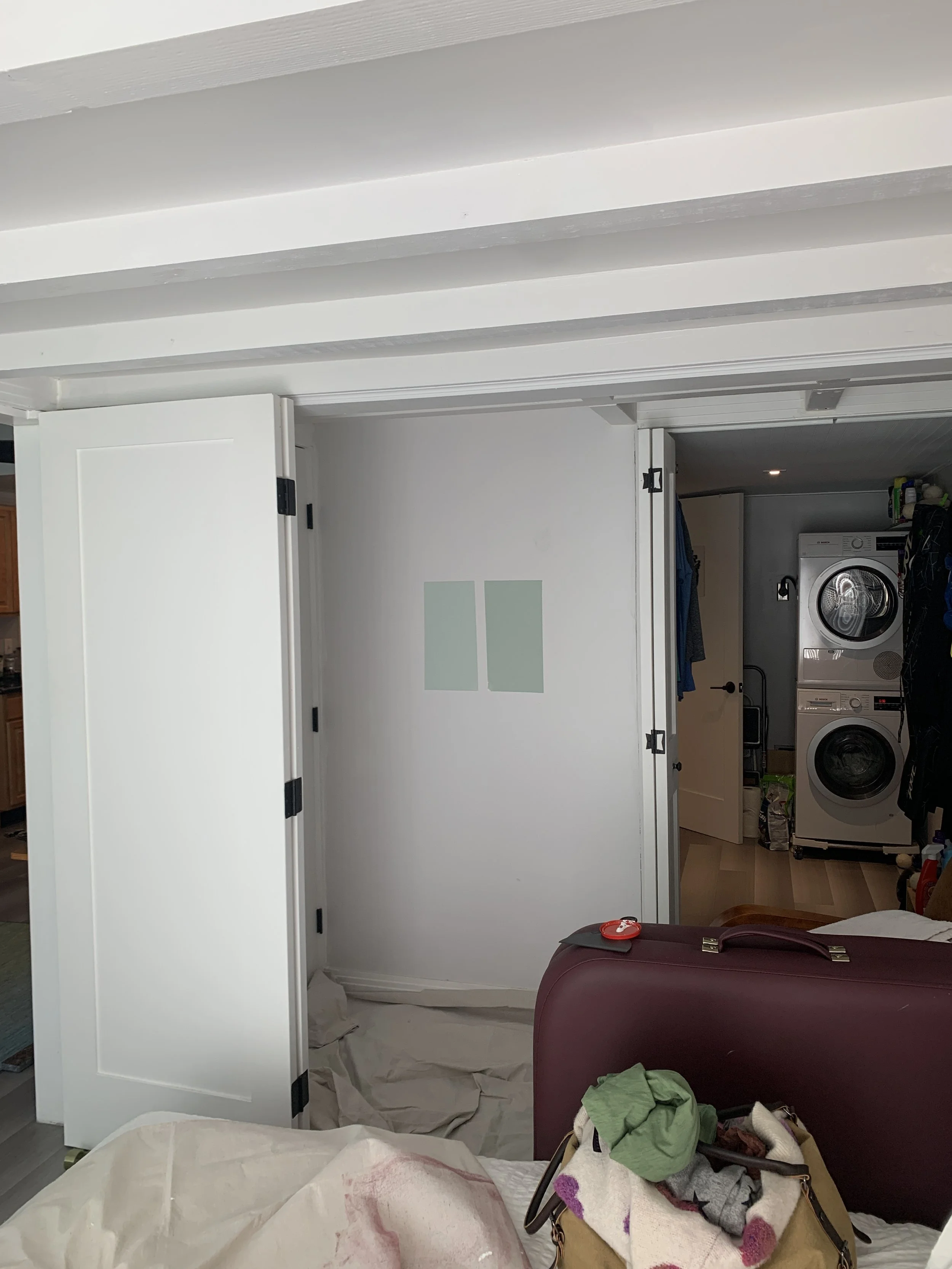
Inspired by the pale green anemones—which also happens to be the color of the ocean at certain times of the year—we chose beautiful, calming Theresa’s Green, Farrow and Ball for one of the bedroom walls. Accent walls may be out of favor with some designers, but I believe that, used wisely, they add definition and interest to open plan spaces—in this instance, creating a cozy reading corner in a previously underutilized space. (Quick aside, we plan to turn the redundant door behind the chair into a solid wall and run the green onto that at a later date.)
This color is the perfect balance of crisp blue and warm green. When paired with red-based Pointing on the other walls and All White (both Farrow and Ball) on the ceiling and trim, the room positively glowed in the morning. The final look is fresh and inviting, highlighting the cottage’s features without harshness.


That same soft clotted cream was used throughout to unify the scheme and give a soft warmth to the space where the previous grey walls had been cold and uninviting. With more ‘zoning’ in mind, we painted one end of the living area, which frames an open fire, in Joa’s White, Farrow and Ball. This works beautifully with my client’s leather chairs and linen fabrics. It is now timeless and cozy without any heaviness.
Sweet treats
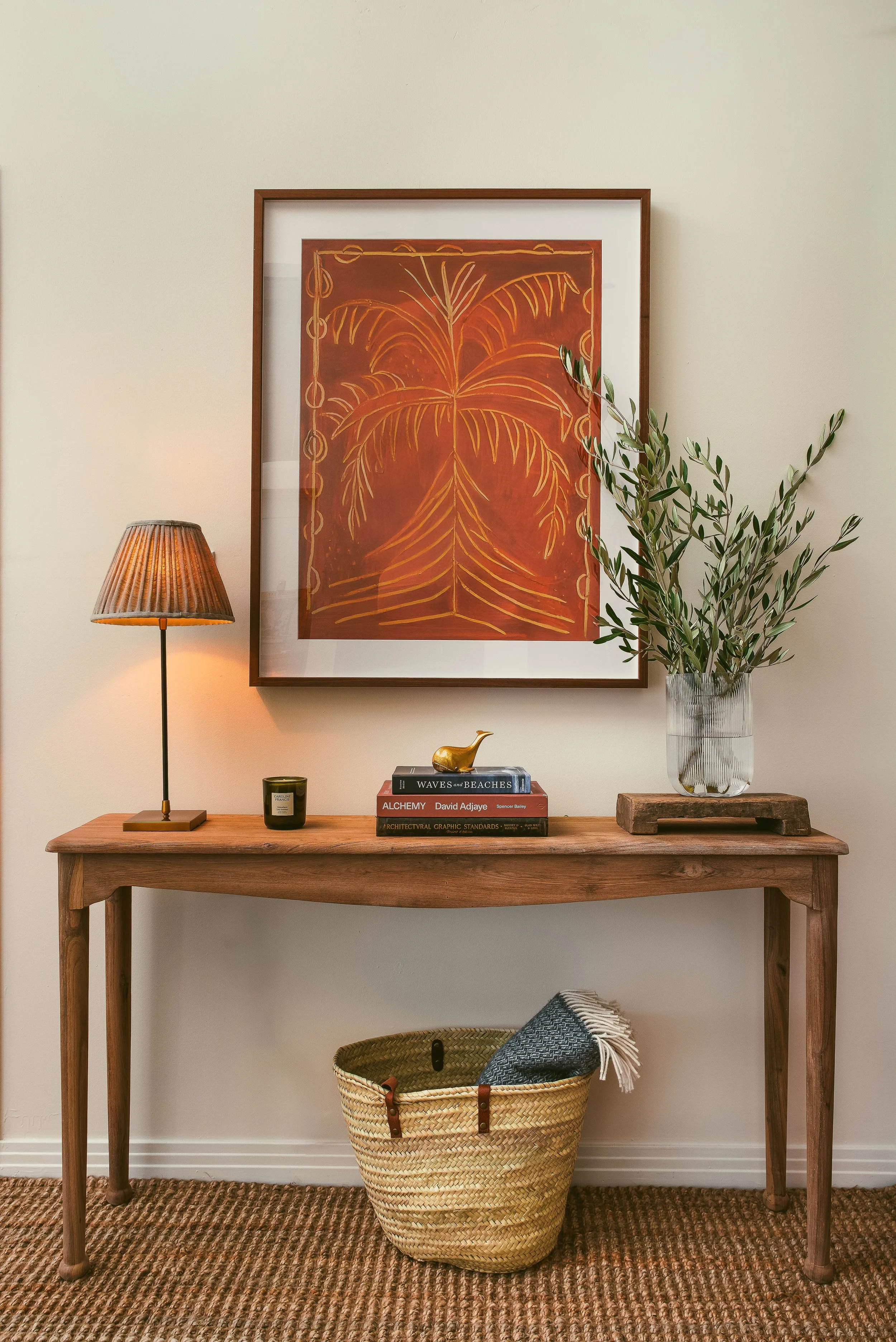
My client loves to cook and has a particular soft spot for desserts, so, for fun, we introduced a delicious pop of Muscovado by Little Greene into the kitchen/dining space in a recessed bar. The contrast adds serious depth, and when lit, the bar has a luminous quality that feels indulgent, glamorous, even—the perfect backdrop for brass barware and vintage glasses. This red-brown is picked up elsewhere in the space, in upholstery and artwork.


Rethinking and reclaiming certain elements of this space, and employing color to enhance definition and flow, has resulted in a small home that now feels fresh and comfortable, with corners of interest and personality.
Need help finding the right colors for your home? Book a free 30 minute consultation.